
The labour share and income inequality
All the recent talk about the Canada’s shrinking middle class and rising income inequality got me thinking that it might be a good time to take a fresh look at a somewhat neglected economic concept: the labour share of income. The labour share of income hopes to measure the portion of the economic pie going to workers. The inverse of the labour share is the profit share or, to use some “old-fashioned†language, capital`s share. Indeed, the whole idea of deriving and comparing income shares has that grizzled Marxist – or Smithian, though few harken back to this aspect of Smith’s legacy – ring to it. Decades of “end of history†hurrah-optimism heralding the end of economic struggles relegated the analysis of income shares to dark, rarely-visited corners of public debate. The still-unresolved global economic crisis, increasing attention to runaway economic inequality and a renewed understanding of the economy as a sphere of conflict have, however, created space for tools like the labour share to once again garner deserved notice.
One way to think about income shares is as the distribution of broad economic power. While relative bargaining power caches out locally in complex ways, big aggregates like income shares, especially as they change over time, can tell us something as well. In particular, combining some facts about how wages are distributed within the labour share with changes in the labour share itself can shed light on long-run trends like increasing inequality and middle-class stagnation.
First, the labour share itself. The chart below shows what has happened to the labour share of income in Canada over nearly the past three decades, stopping in 2010. The chart goes back to 1981 largely because this is the date at which Statistics Canada stopped its backward revision of time series data. In creating it, I have followed as many of the methodological points outlined by Louis Morel (2006) from the Bank of Canada as far as I could for a relatively quick blog post.
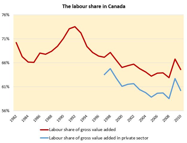
Figure 1. Labour share of income in Canada, total employment and private sector (Source: Statistics Canada).
(Wonkish paragraph follows; skip if you don’t like math and/or don’t care for the nuances of data.) The numerator in the ratio is simply the aggregate of employee compensation for the Canadian economy. The denominator is what I am calling gross value added which is gross domestic product less gross self-employment income (gross mixed income) and taxes less subsidies. How to deal with self-employment income is a bone of contention in calculating labour shares; this method is relatively simple and makes the at least plausible assumption that the mix of capital and labour income for the self-employed is the same as for the rest of the economy (see Morel’s paper for more details on this). I’ve also added a second shorter time series that takes a stab at the private sector labour share. I approximate this by removing compensation going to workers in the government, health, education and social services sectors from total compensation and removing this item as well as capital depreciation by the government sector from gross value added (again, in line with assumptions from Morel).
The chart is fairly self-explanatory. As expected, it shows a generally declining share of labour income punctuated by counter-cyclical spikes during recessions – when profits generally temporarily fall quite badly and the labour share rises. The private sector share appears to decline more rapidly for the 2000s than the overall measure but also spikes more during the latest crisis. The steady decline in the labour share has accompanied changes in the economy since the 1980s that have weakened the economic power of workers vis-à -vis employers.
Over the past decade, however, the decline in the labour share has not been that rapid and indeed, taking into account the fallout from the latest crisis, the trend is not as pronounced as that in the preceding decade. In one way, this makes sense in light of a different proxy for the economic power of labour, the rate of unionization. This has also been relatively stable recently after earlier precipitous decline.
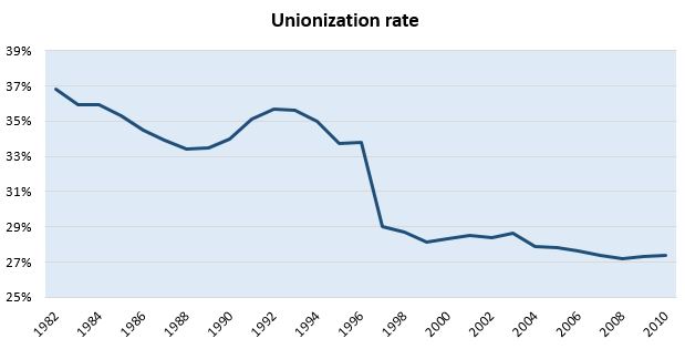
Figure 2. Canada’s unionization rate (Source: Statistics Canada).
On the other hand, trends in the growth of inequality have not abated and workers continue to feel squeezed. Turning to the inequality data will help make sense of this. For example, some people receiving employment income have been doing quite well. Over the past three decades, the share of the compensation of the 1% in total compensation has more than doubled and was close to tripling before the crisis.
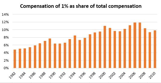
Figure 3. Share of wages and salaries in the income of the 1% (Source: Global Top Incomes Database).
Putting this fact together with the previous calculations of the labour share of income produces this:

Figure 4. The labour share of income, with and without the 1% (Source: Statistics Canada and the World Top Incomes Database).
Looking at inequality within those who earn employment income shows even more about what has been happening to the economic power of those workers in the majority not making CEO salaries. The just over 2% difference in the labour share of all workers and the 99% becomes one of almost 7% not three decades later.
I will stop this post here, but I continue the conversation on my blog with some more thoughts…on why We can’t all be workers.
Great post, although did you have any thoughts on why unionization has been going down? It takes a nose-dive after 1996.