
Have Taxes Changed All That Much Over the Past Half Century?
A recently released Fraser Institute report claims that the tax bill of the average Canadian family grew by a whopping 1,624% since 1961. This is an enormous number, designed to appeal to our sensationalism-hungry media, but it does not provide a meaningful comparison of today’s average tax bill and the tax bill our parents’ and grandparents’ generations faced fifty years ago.
To begin with, the numbers should be adjusted for inflation — something the Fraser Institute did not do. A dollar in 1961 bought a lot more than a dollar today buys, so is it doesn’t make sense to compare the tax bill in 1961 dollars to the tax bill in 2009 d0llars. Once adjusted for inflation, that 1,624% increase shrinks to just 137%.
On top of inflation, we need to consider that incomes also grew over the last half a century, so the tax bill would have grown even if we paid the same proportion of our income in taxes in 2009 as in 1961.
What we need to compare, then, is not be the change in absolute dollars that families pay in taxes, but the change in the share of family income that goes to pay for taxes.
In the 2009, the average family paid 41.7% of their income in taxes (at least according to the Fraser Institute — but they count business taxes as part of the family tax bill, which is highly problematic as I explain in a previous post).
In 1961, families paid 33.5% of their income on taxes, but by 1969 they were paying 39% and in 1974 they paid 43.4% of their income. So, if you compare the 2009 effective family tax rate to 1961, you will find a 25% increase, but you will only report a 7% increase since 1969 and an actual decrease since 1974. Therein lies the peril of summary statistics – calculating the percent change over time crucially depends on your starting and ending point. A few years either way would result in completely different numbers.
And we wonder why people are so suspicious of statistics.
The best way to avoid this kind of statistical tricks is to show as much of the underlying data as possible and let people see the patterns for themselves. The Fraser Institute reports plots taxes as a share of income in Figure 4 of their report, which I have pasted below.
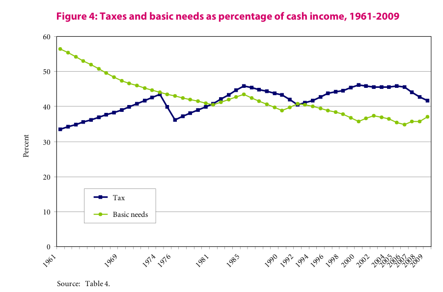
The Fraser Institute’s conclusion that “the average Canadian family’s tax burden has been rising steadily for the better part of 48 years” is clearly not supported by their own graph.
The share of income going to taxes rose quite fast in the 1960s and in the decade between 1976 and 1985 but is has hovered around 45% ever since. This graph clearly demonstrates that the latest Fraser Institute report is much ado about nothing – the effective tax rate as a share of average family income has been stable over the past quarter century.
Fraser Institute’s alarm over tax increases captures the tax increase over the 1960s, when many of Canada’s core social programs, such as Medicare, were first established.
No news here, folks, unless you are interested in picking up some tricks on how to present statistics in a way that makes the growth of a spending item of your choice appear larger than it really is. (For a quick lesson on statistical literacy, tune in later for my next post.)